


Why accessibility matters

Hi there,
If you follow me on Twitter, you know that I love to tweet about… well, pretty much anything. But I particularly like to share things about writing, design, and everything in between.
A while back, I learned about something called Bionic Reading through Christophe Pasquier. I tweeted it out into the world and it quickly went viral, racking up 24k retweets in a couple of hours.
I was blown away by the reactions on my tweet, and how this new way of formatting text seemed to help people in all kinds of ways, so it inspired me to dedicate this issue to accessibility in UX writing — one of the most important areas in this line of work.
— Juan


Here’s the tweet I was talking about earlier.
Created by Renato Casutt, Bionic Reading is a way of marking up words so they become easier to read. At first glance, it’s quite a simple system — by bolding the first part of every word it becomes easier to read a text, as it gives your brain something to latch on to.
I was blown away by the reactions on my tweet — people from all over the world replied saying that it did something for them. Some were able to read faster and concentrate better on the content, but more importantly, it seemed to help people who usually have a hard time reading. I received multiple replies from people with dyslexia saying that they were able to read the text much faster than they normally would — while understanding the meaning of the text better.
Just a couple of Twitter replies don’t say much, of course. There hasn’t been any scientific research done on Bionic Reading yet, and this will need to be done in order to say anything more substantial about its benefits.
However, these early reactions indicate that it could potentially help people read faster and understand text more easily.
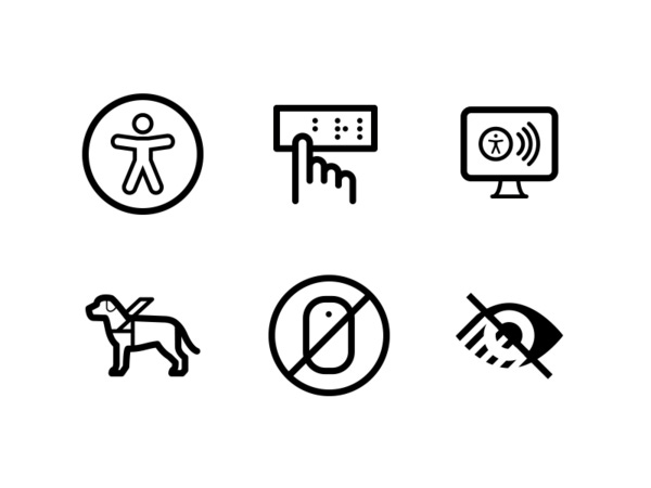
Accessibility
We’re fast approaching 8 billion people on earth. That’s a lot of people, and as designers and writers in tech we have the responsibility to make sure that we create products that provide equal access to all of them, especially those with disabilities.
Words take up a lot of the screen in the apps, games, and other digital services we interact with every day, and they can be hard to parse for all kinds of different reasons. As mentioned earlier, people can suffer from all kinds of disabilities that can make it more difficult to read and understand text.
Dyslexia is a well known example, which is a common learning disability that leads some people to have trouble reading at a good pace and without mistakes.
There are also less obvious ones like ADHD, which most people associate with restless behavior, but which can also make it harder to concentrate for extended periods of time. Therefore, this can also make it hard to read longer pieces of text.
Then there are visual impairments like partial sight and blindness, which can make it hard or impossible to read any text at all. For these people it’s common to use a screen reader, which is a software or hardware solution that reads the words out loud and describes the interface.
In short, accessibility is about making sure that everything works for everyone. That means that we need to design and write for everyone — addressing how people with disabilities use digital products while also thinking about how we can build things that work well with assistive technology.

Better for everyone
The best thing about creating an accessible experience is that it often doesn’t just help people with special needs, it actually benefits everyone.
If you make texts shorter and use simple language, you’re not just helping those who normally have a hard time — you’re making it easier to read for everyone.
When you make sure that text is easy to read for folks with low vision by using appropriate font sizing and the right colors, you ensure excellent readability for everyone.
All in all, creating accessible experiences is important because we want to enable everyone to use what we build. As writers we have lots of influence on design, and we should use that power to ensure no one gets left behind.
There’s a lot more I’d love to share about accessibility and inclusion, like diving into best practices for accessible UX writing, but I’m trying to keep these issues short!
Let me know if you’re interested in learning more about this and I’ll happily dedicate future issues to this topic.

UX Writing Highlights
For this issue’s highlight I wanted to take a look at accessible UX writing at Instagram. Meta, Instagram’s parent company, has a large team of excellent Content Designers, and I think this screen offers a great example of their work.
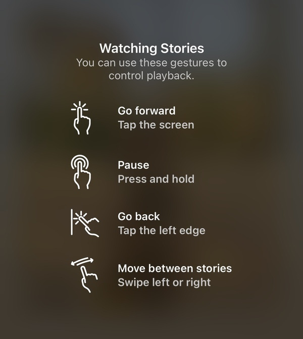
You see this screen when you open a story on Instagram for the first time. Navigating this part of the app works a bit differently than most apps, so there’s a bit of onboarding.
I think the team has done a great job at explaining the gestural interface with very little words. For most people this screen would take less than 10 seconds to parse because of the simple language and straightforward design.
It’s a great example of accessible UX writing as all four gestures are explained in 7 simple words or less, which makes it very quick to read for anyone — no matter their reading skills. The icons add visual context to make the movements even easier to grasp.
You don’t want people to get stuck on the screen that explains how an app works — you want them to use the app. And thanks to this simple screen, people will be browsing their friends’ stories within seconds.
As I wrote in the last newsletter, I’m trying to write shorter issues so I can send them out more often. This one still ended up to be quite lengthy, so I’m going to cut the next one down even more.
Let me know if you like where it’s going — just reply to this email :)
Thanks for reading this far and talk soon! ☀️